

A kitchen splashback protects the wall where the room works hardest and helps connect the cabinets, worktop and lighting. The best choice starts with the position: a sink-side wall, a preparation run and the area behind a hob can have different requirements.
Use this guide to compare tile, glass, metal, laminate and other finishes, then bring the sample beside the actual door and worktop. Real JS DECO kitchens show how a splashback can create contrast, continue a surface or add pattern without becoming the only feature in the room.
Start with the wall, appliance and worktop
Decide which parts of the wall need protection, how high the splashback will rise and where it will finish. Consider the sink, hob, window, extractor, sockets and shelving together. A full-height feature wall, a worktop-height strip and a panel below wall cupboards each create a different composition.
For the area behind a hob, confirm that the specific product and installation suit the appliance, including its heat and clearance requirements. Glass, mirrors, laminates and adhesive-backed products should not be assumed suitable simply because they are sold as decorative wall finishes. Agree that specification before ordering cut-outs or final sizes.
- Sink and preparation areas
Prioritise a cleanable surface and considered joints with the worktop, window and surrounding finishes.
- Behind the hob
Match the selected panel, adhesive and installation detail to the hob manufacturer’s requirements and the product’s intended use.
- Height and termination
Decide where the surface starts and stops. Align edges deliberately with cupboards, windows, shelves or the extractor.
- Colour and lighting
Compare the sample with the door and worktop under daytime and evening light. Texture and reflections can change the result.
Tile offers pattern, texture and a choice of scale
Ceramic and porcelain tiles can provide a simple backdrop or a more prominent pattern. Rectangular tiles, a herringbone layout and geometric formats create different rhythms; grout colour can either emphasise the individual pieces or make the area read more quietly.
Compare the grout joints and cleaning requirements as well as the tile face. Natural stone or porous finishes may need sealing according to the supplier’s guidance. Plan the setting-out around sockets and cabinet edges so that the pattern is considered rather than left to the last cut.
The Stroud kitchen places patterned tiles between green worktops and white wall cupboards. Open oak-veneered shelving and the coloured surfaces give the tile pattern a clear setting.
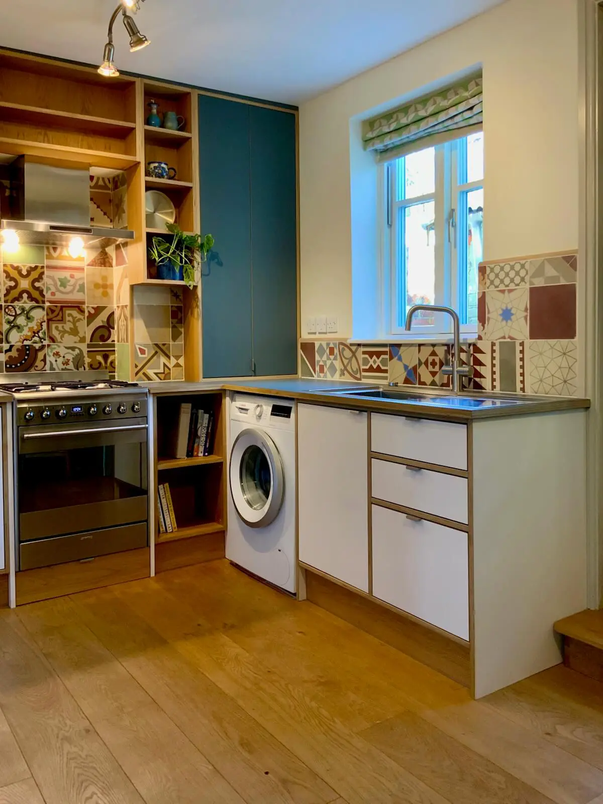
In a white kitchen, a restrained tile can add texture without strong contrast. A coloured or patterned tile can instead become the feature. Both approaches work best when the grout, cabinet finish and worktop are selected together.
Continue a worktop material for a coherent backdrop
A continuous-looking surface can connect the horizontal worktop with the wall behind it. Depending on the product and installation, larger panels can reduce the number of visible joints. Consider the pattern scale, corners and socket positions before deciding how the surface should be cut.
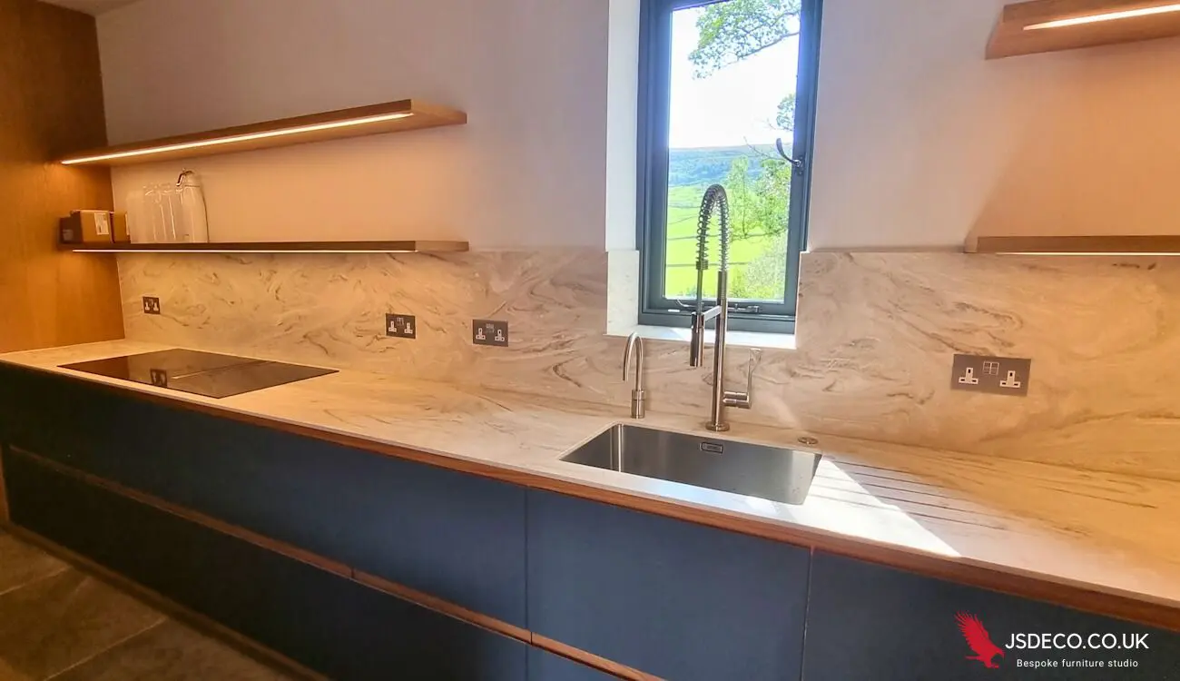
The chef’s kitchen at the top of this article shows Corian across the worktop and splashback. Our Corian worktop page explains that surface choice. In Matlock, green FENIX worktops and splashbacks provide a coloured backdrop to birch plywood cabinetry.
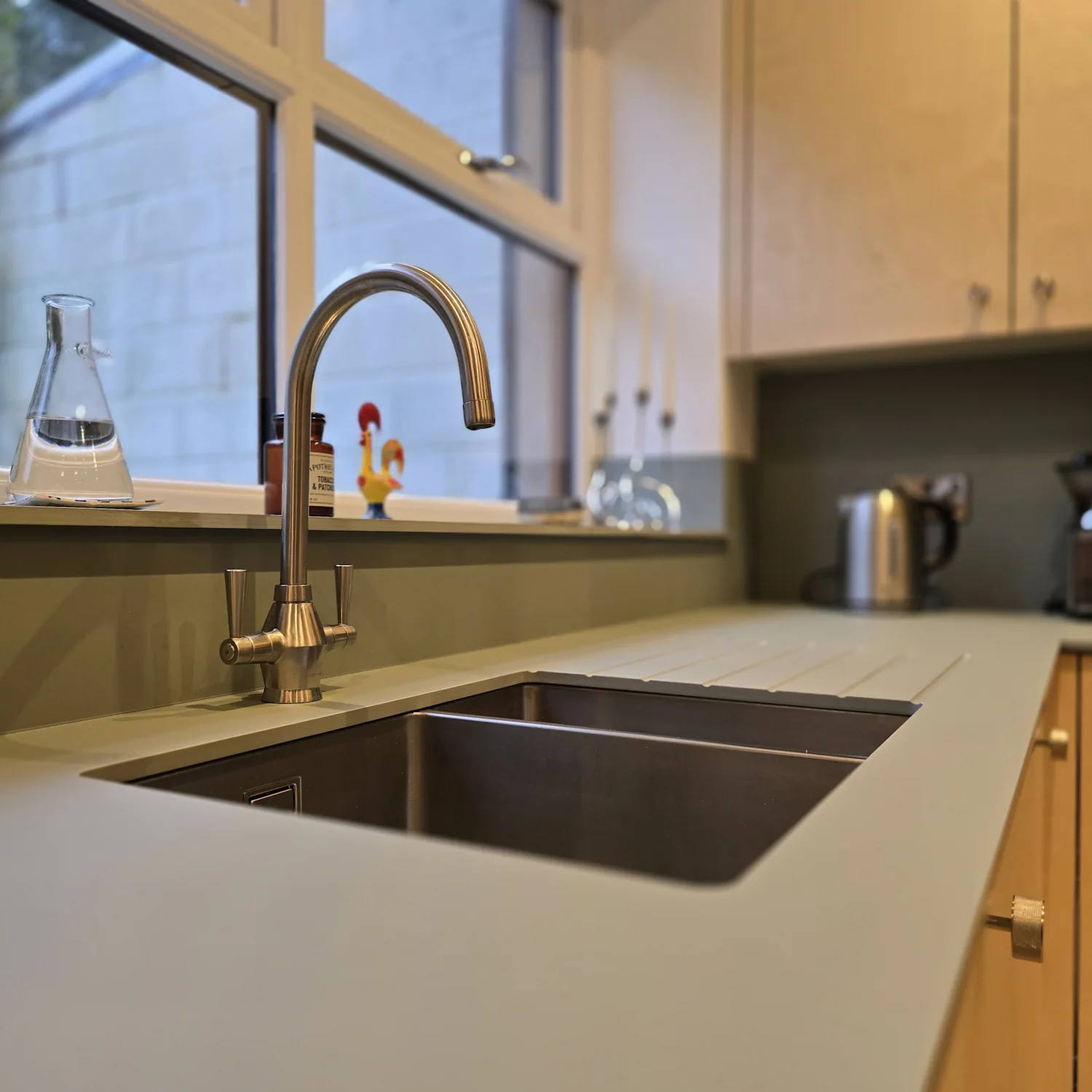
Ceramic and porcelain slabs offer another way to use larger areas of pattern. Their suitability, support and fabrication requirements depend on the actual product. Compare them through the kitchen worktop guide rather than assuming a similar appearance means the same performance.
Glass, mirrored finishes and metal create different kinds of reflection
Glass can provide a colour, a transparent layer or a reflective surface. A mirror can make the view feel deeper, but also reflects whatever sits on the worktop. Compare the intended effect with the practical details: cleaning, cut-outs, joins and product suitability for its location.
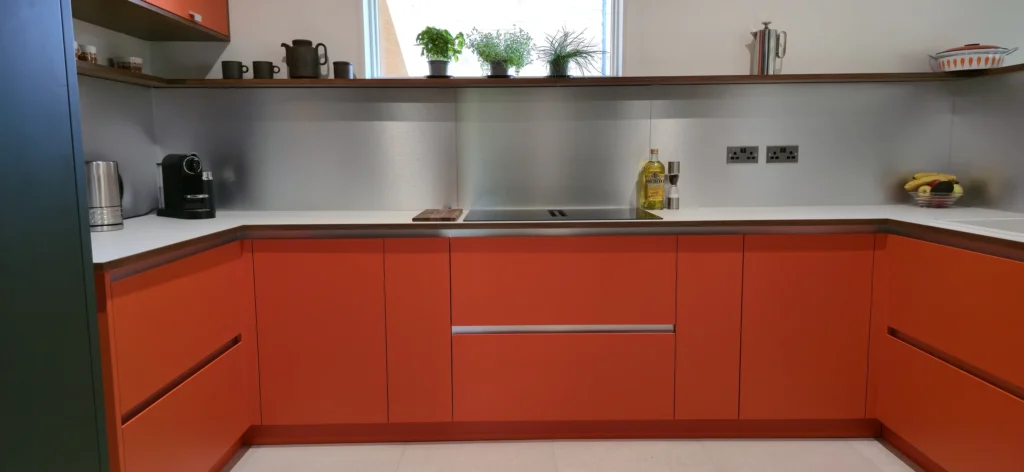
Stainless steel can suit an industrial or working-kitchen direction. Brushed, polished and textured finishes have different appearances and cleaning characteristics. A metallic look can also be achieved with a decorative laminate, which should be described accurately rather than treated as solid metal.
The orange and olive-green Cawthorne kitchen uses silver-finish laminate splashbacks on moisture-resistant MDF, alongside pale Egger laminate worktops. The splashback contrasts with the painted fronts; it is not a stainless-steel panel.
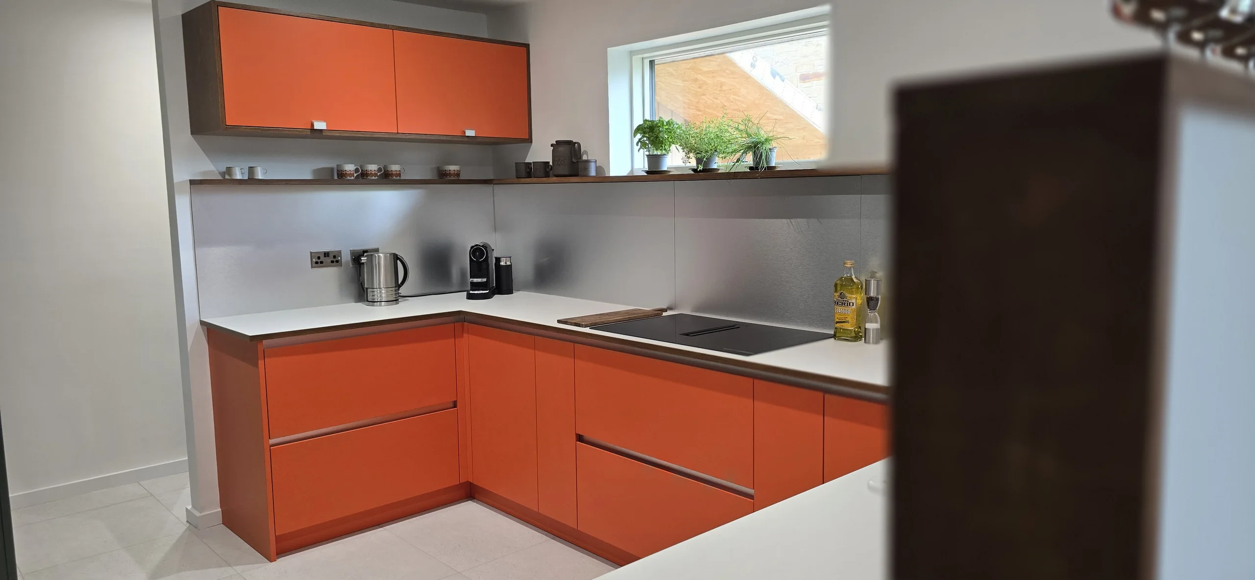
For a more coordinated matt palette, explore FENIX kitchen finishes. Choose the actual wall product and construction separately from the door finish: the same colour name does not establish that a front material is suitable behind a hob.
Consider budget finishes and timber in the right locations
A simple tile, restrained panel layout or a smaller area of a more distinctive finish can control cost without making the kitchen feel incomplete. Compare preparation, fabrication, cut-outs, joints and fitting alongside the material price. A low-cost sheet can involve substantial installation work if the wall needs correcting.
Peel-and-stick tiles may provide a decorative update in a suitable location, but the specific product needs to suit the surface and conditions. Treat them as a product-led option, not a universal replacement behind cooking appliances or in regularly wet areas.
Timber and shiplap can introduce texture on an appropriate feature wall. Their coating, cleaning and location need careful consideration; do not assume that a sealer makes timber suitable immediately behind every hob. An alternative is to bring timber into shelves or cabinet details while using a suitable splashback on the working wall.
Bring the sample and installation details into one decision
- Choose the visual role
Decide whether the splashback should blend with the worktop, contrast with the fronts or introduce a pattern.
- Review the sample in the room
Compare it beside the actual door, handle and worktop, with the planned lighting switched on.
- Coordinate the openings
Confirm sockets, windows, extractor positions and shelving before final measuring or panel fabrication.
- Agree fitting and care
Confirm the product’s suitability, the wall preparation, joints and cleaning guidance as part of the specification.
The result should support the whole bespoke kitchen. If several surfaces compete for attention, simplify one of them; if the room feels too uniform, a considered splashback can provide the contrast.
Frequently asked questions
Should the splashback match the worktop?
It can, but it does not have to. Continuing a surface creates a coordinated backdrop; a different colour or pattern can provide contrast. Compare both with the actual cabinet sample.
Can I use any glass or mirror behind a hob?
No. Specify a product and installation suitable for the exact appliance and location. Confirm the supplier’s guidance and the hob requirements before ordering.
What is a practical splashback for a white kitchen?
A quiet tile or pale panel can keep the palette restrained, while colour, pattern or metal can create a feature. Include cleaning, joints and lighting in the choice.
Is a silver splashback always stainless steel?
No. A decorative laminate can create a metallic appearance. Cawthorne uses silver-finish laminate, so appearance alone is not enough to identify the material.
Choose the splashback beside the worktop
Compare the two surfaces together so their colour, joints and care requirements support the same kitchen brief.
Explore kitchen worktop materials
Use the material guide to narrow the surface choices before coordinating the wall finish and cabinetry.